Crop reports and dashboards are essential tools for farmers to track and monitor farm’s performance. Reports provide granular data for further analysis. Dashboards are visual representations of this data that allow farmers to see trends and patterns quickly and easily.
Crop reports help farmers to make informed decisions about planting, harvesting, and marketing their crops. For example, if a farmer sees that a particular crop is not yielding well in their area, they may choose to plant a different crop that is better suited to the local climate. Similarly, if a farmer sees that there is high demand for a particular crop in their area, they may choose to plant more of that crop to take advantage of the market.
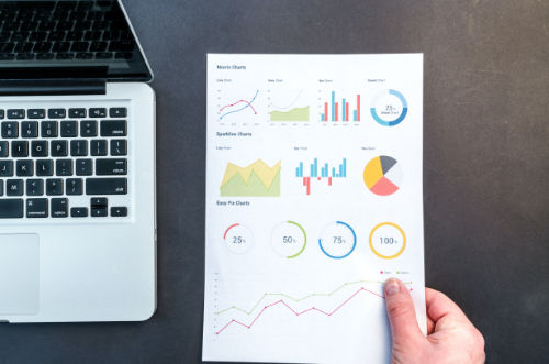
Dashboards are a valuable tool for visualizing data. They allow farmers to quickly spot trends and patterns in the data that might not be immediately apparent from looking at raw numbers. For example, a dashboard might show that corn yields have been steadily increasing over the past few years while soybean yields have been declining. This information can help farmers make informed decisions about which crops to plant in the future.
Crop Reports and Dashboards in AgNote
Easy data collection is just one part of good farm management software. After the data is saved, it is equally important that the collected data is available to support sound business decisions.
To help with decision making, AgNote provides four dashboards:
- Main Dashboard displays the overall account metrics, including the monthly land cost per company, current farmland acreages, varieties planted, etc.
- Permanent Crop Dashboard shows crop acreages, age groups of the crops, their yield history, etc.
- Produce Crop Dashboard shows produce (vegetable) crop planting information such as crop acreages, yield history, etc.
- Row Crop Dashboard displays the planted varieties, the status of the next planting, the current irrigations, etc.
All dashboards are customizable. Each user can choose which charts to show, hide, and in what order. Many charts on the dashboards provide quick filter. Quick filter allows user to select what data they want to see on the chart.
Report highlights:
- Quickly download or share reports. When emailing a report, the user can enter a message for the recipient.
- Reports can be scheduled in advance to be emailed automatically, with the frequency chosen by the user.
- The scheduled reports can be customized to include data only for the selected companies.